Visual Brand Identity
Crafting modern visual identities through purposeful minimalism, striking pattern design, and unique digital collages.
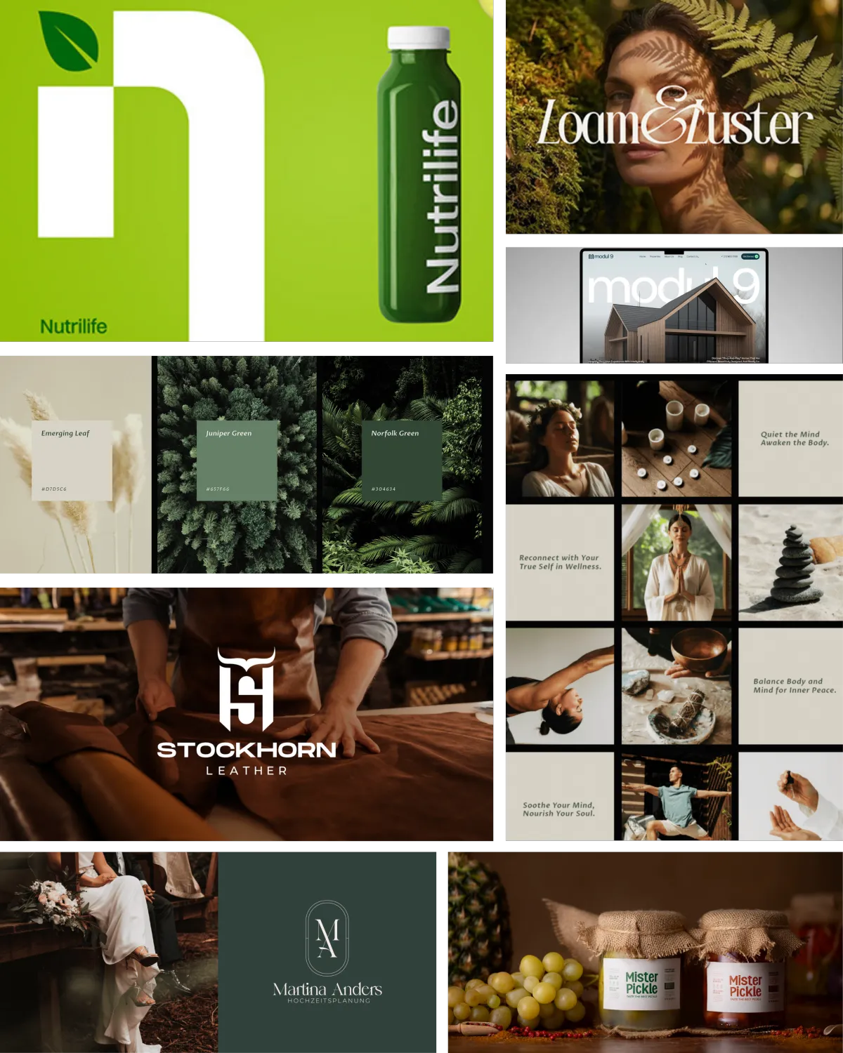
Minimalist and Premium-Looking
Visual Branding Design
Graphic Motif Integration
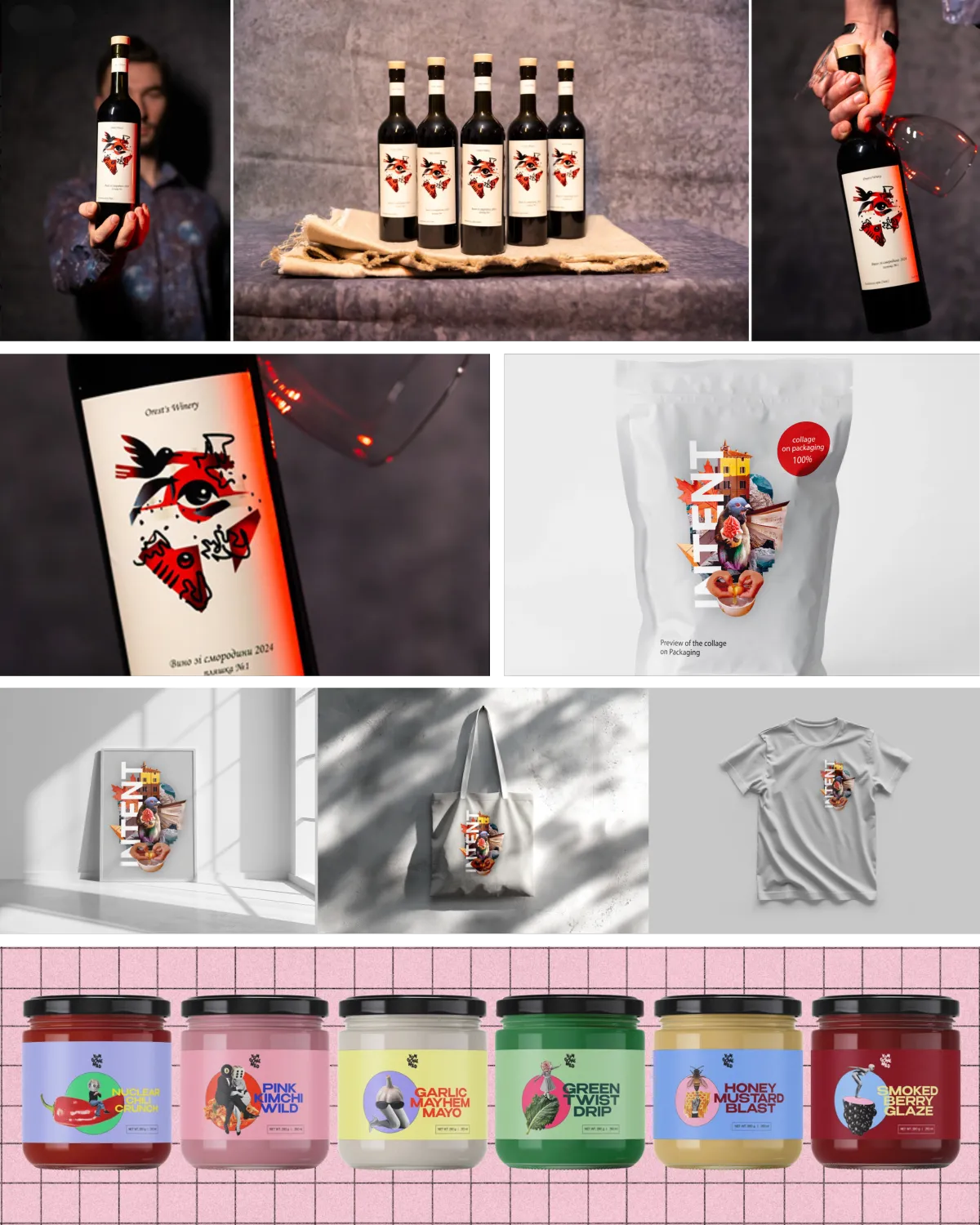
Digital Collage Brand Visual Identity
Minimalist and Premium-Looking
Visual Branding Design
Graphic Motif Integration
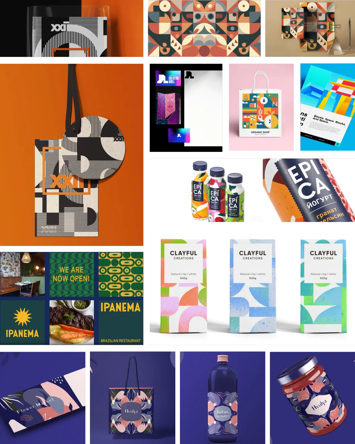
Digital Collage Brand Visual Identity
These images are for inspiration purposes only. All rights belong to their respective owners.
If these styles speak to you, let me bring your envisioned brand to life.
Featured Brand Identities
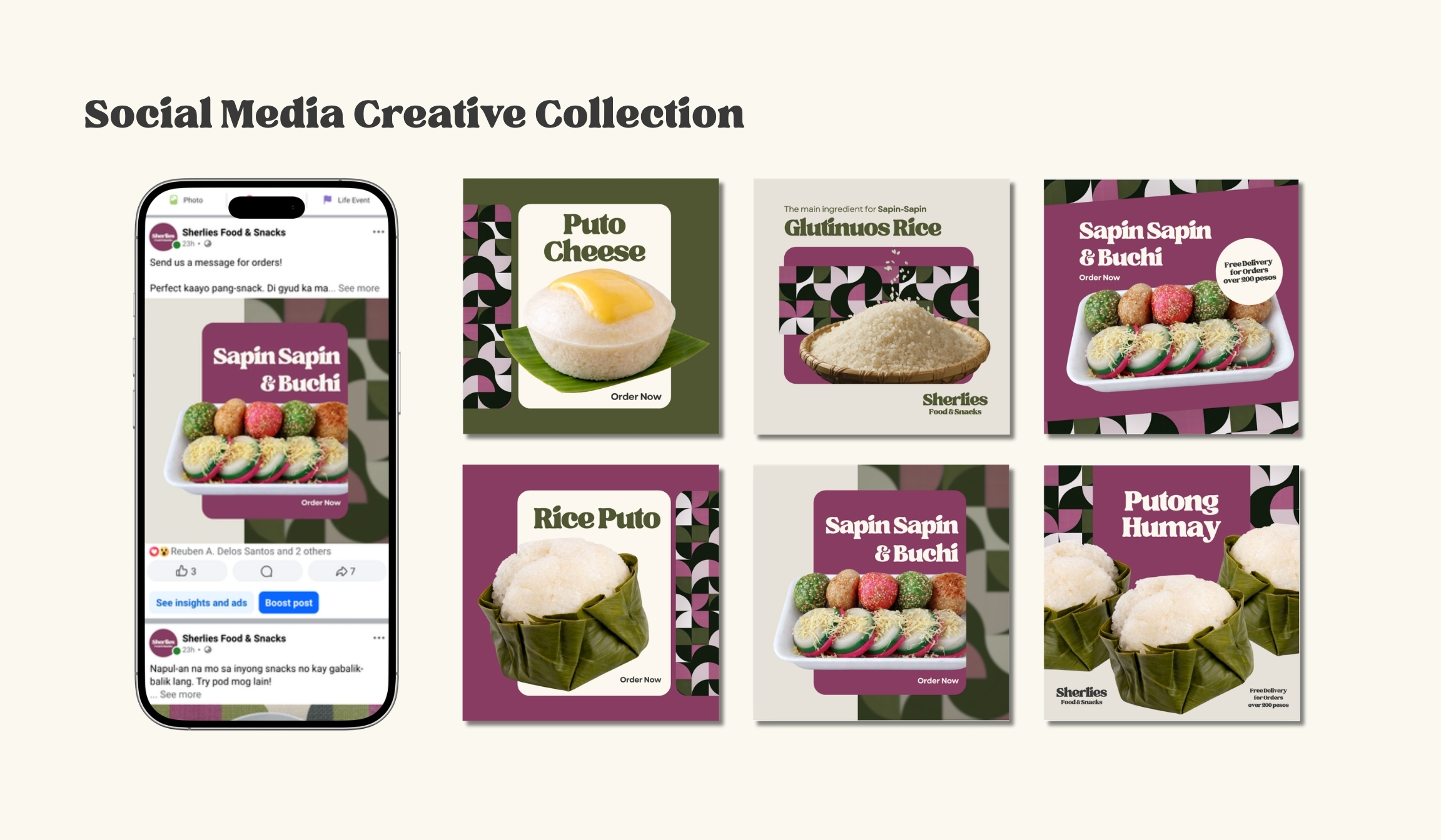
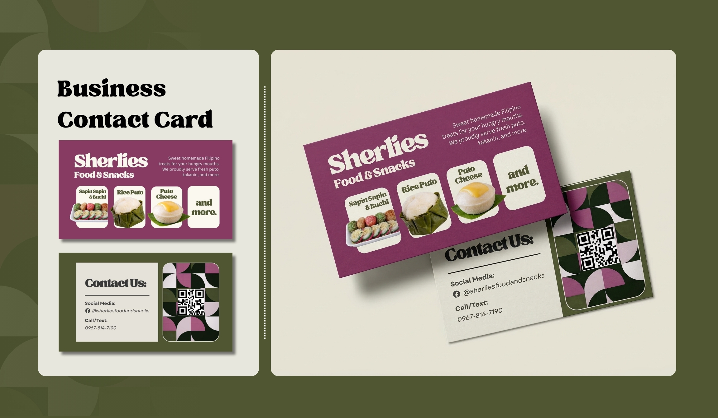
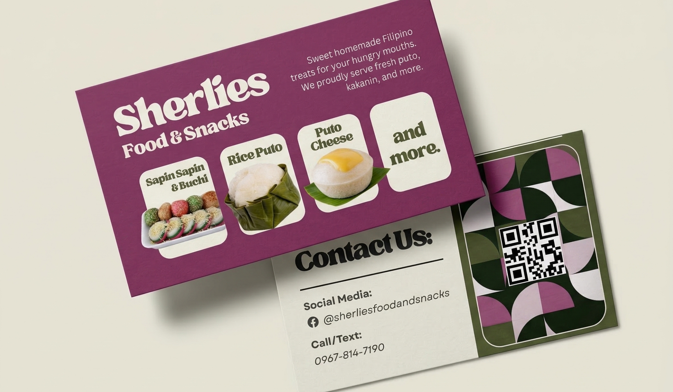
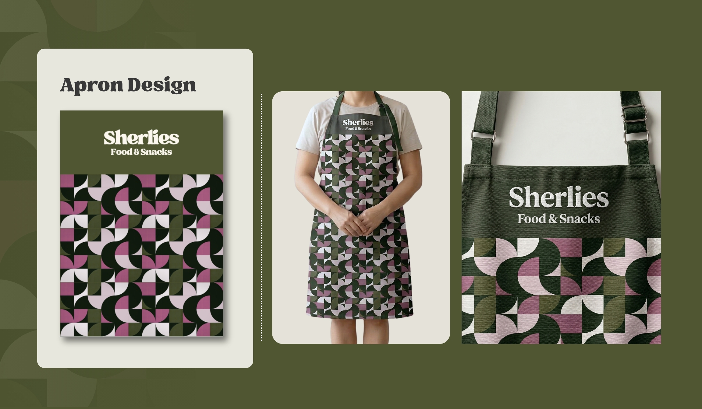
Brand Identity & Design Rationale
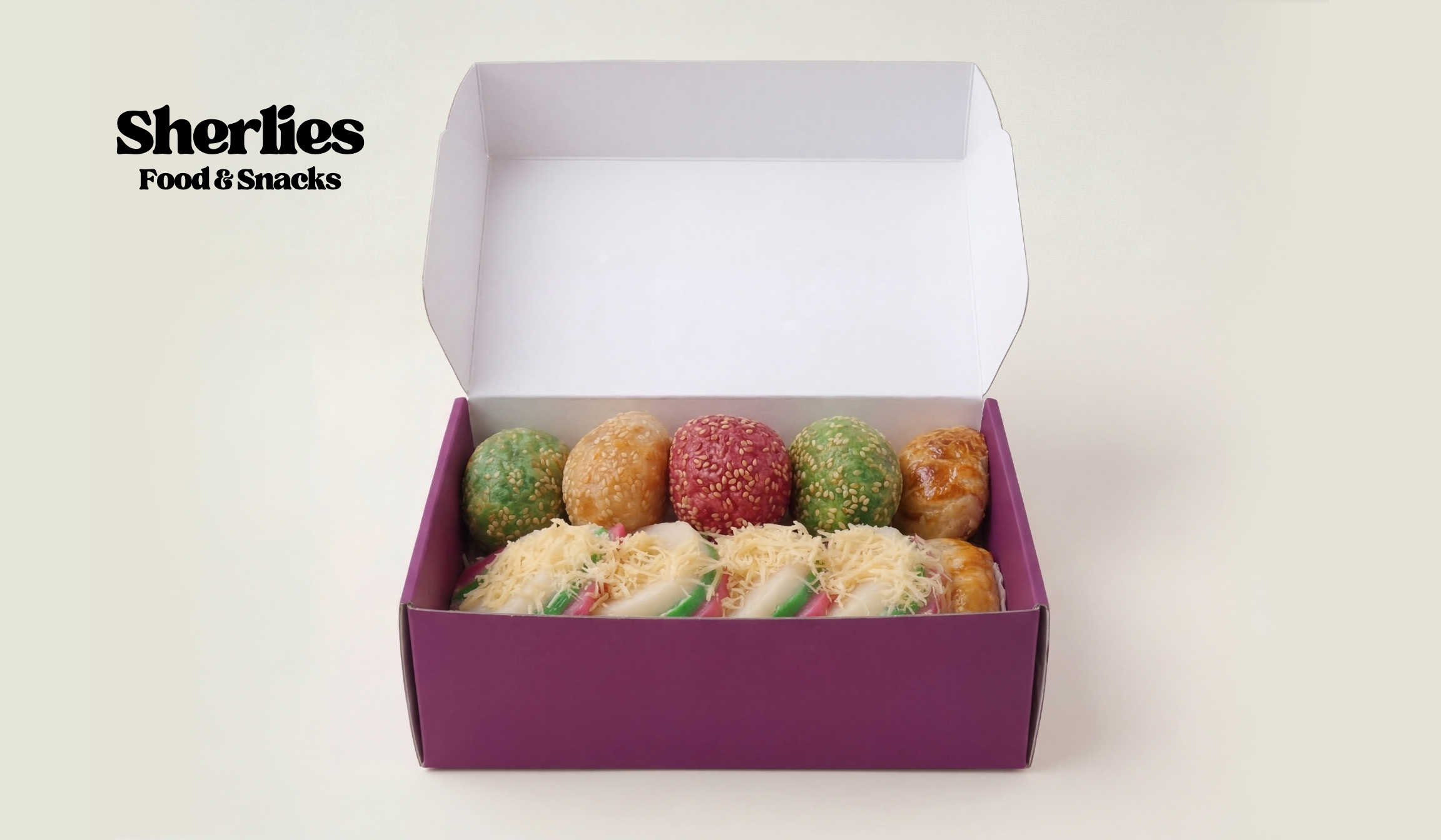
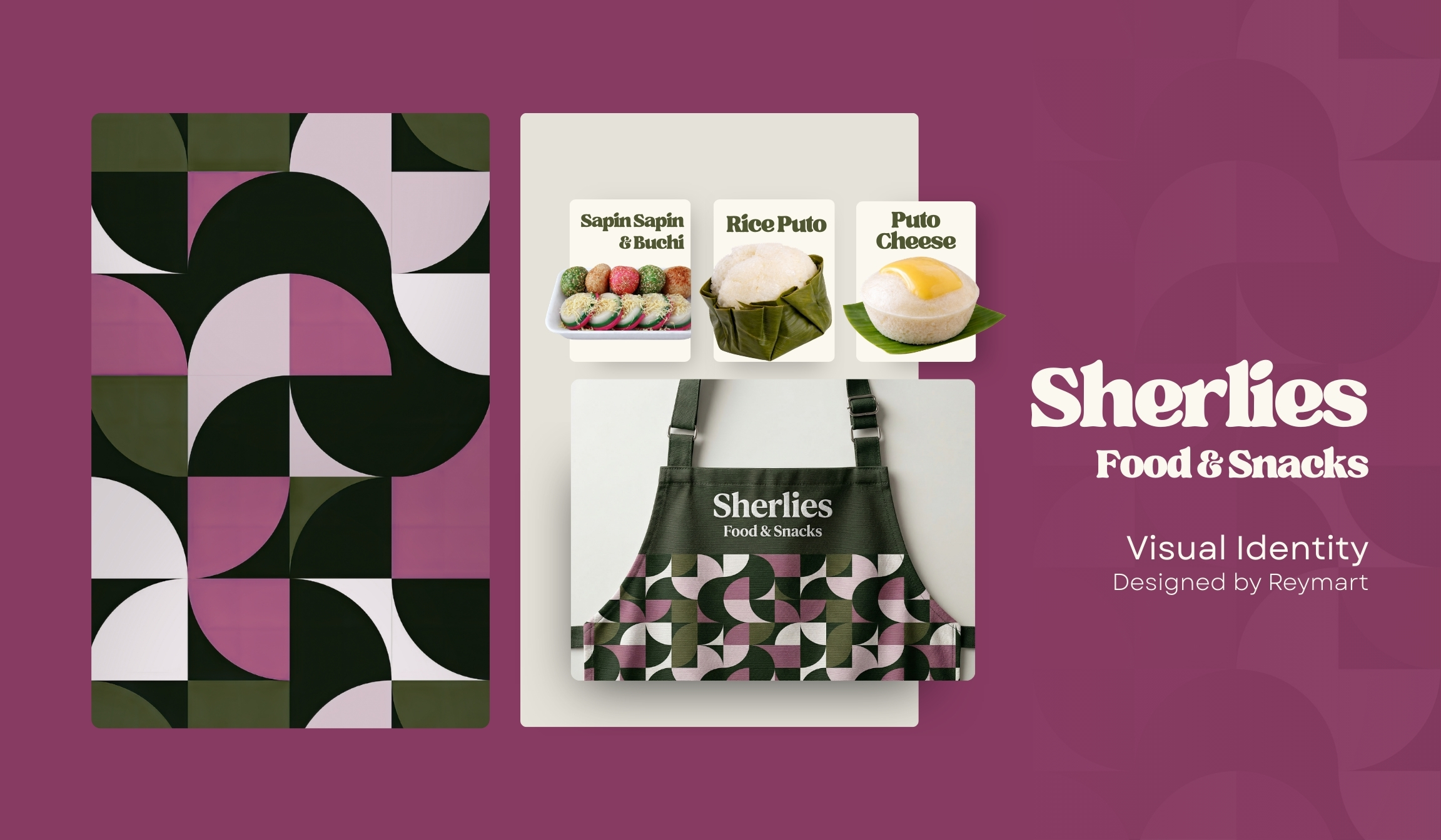
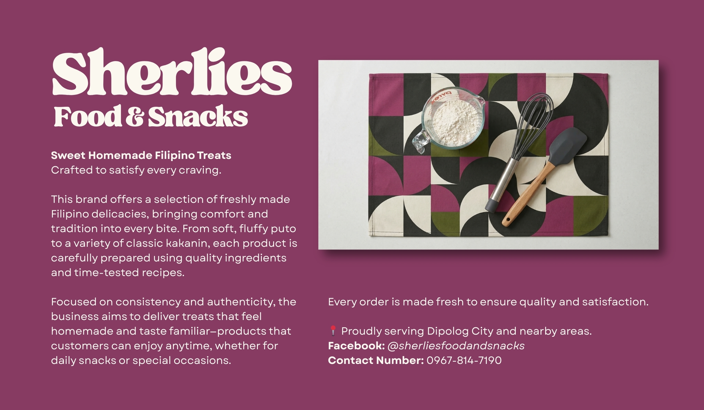
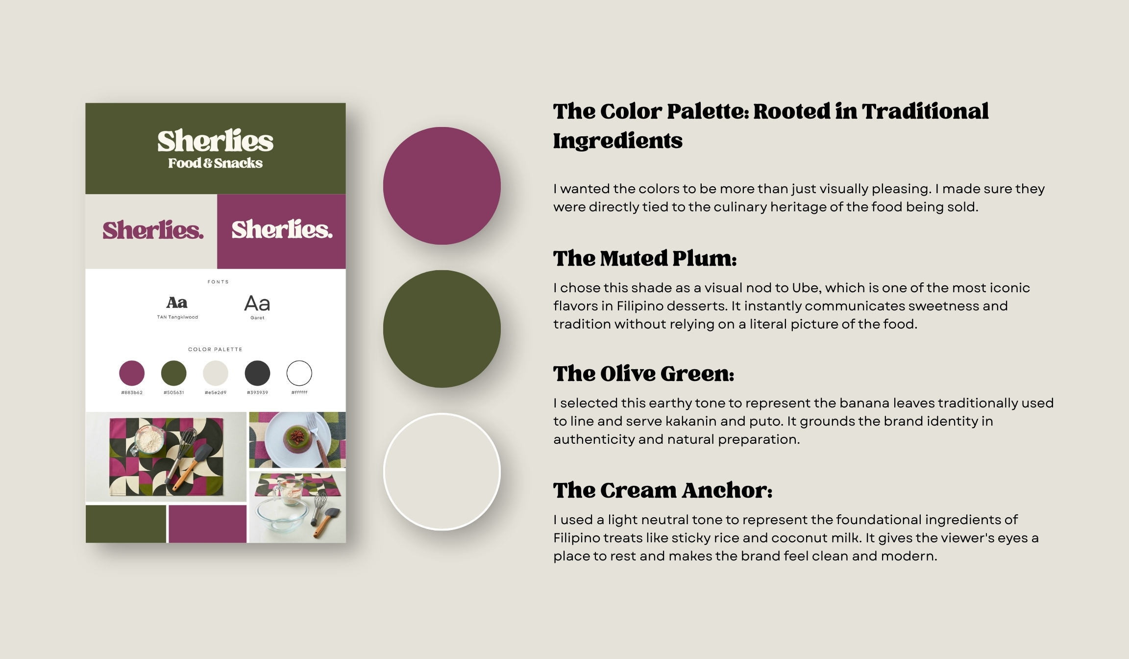
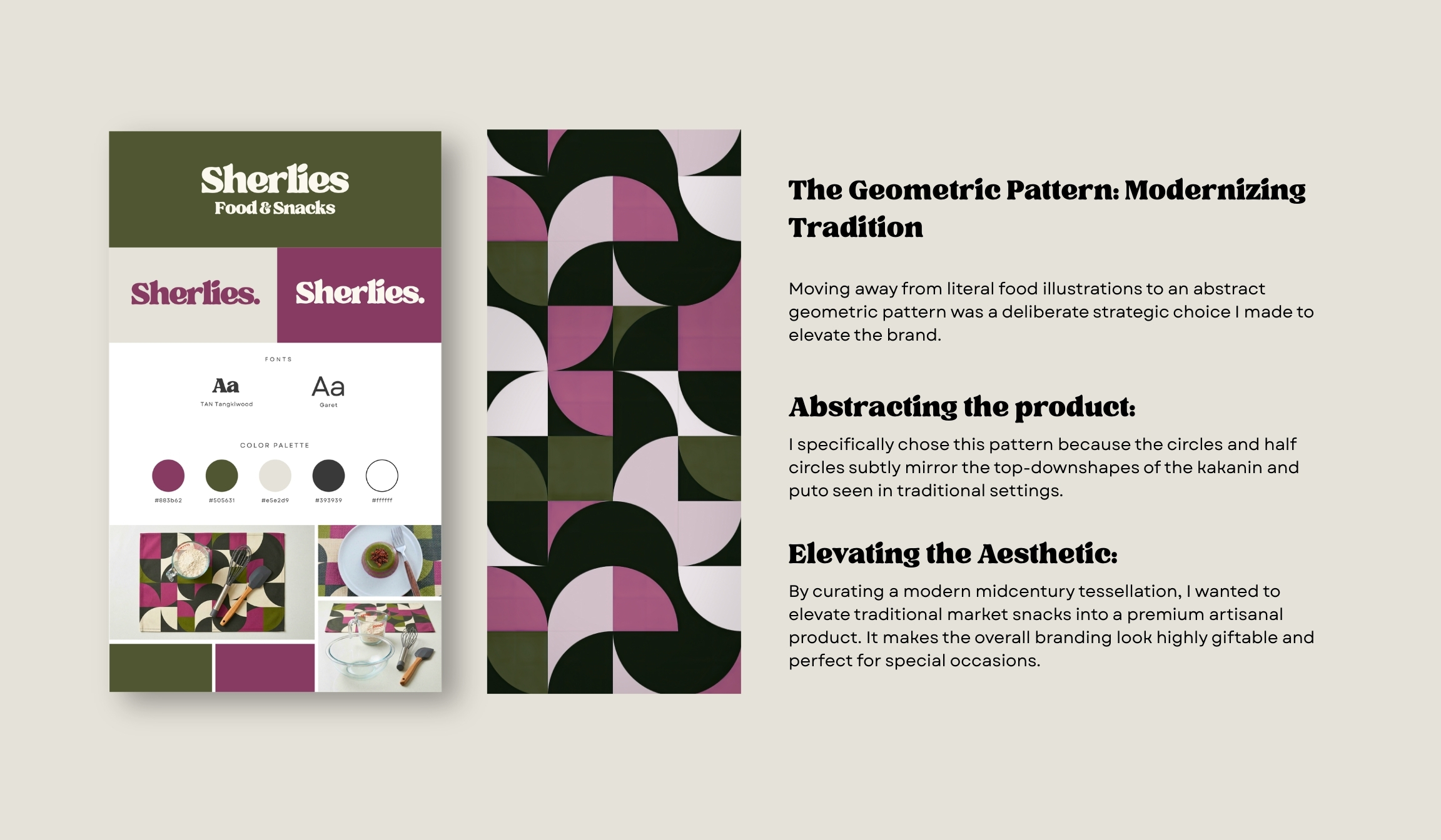
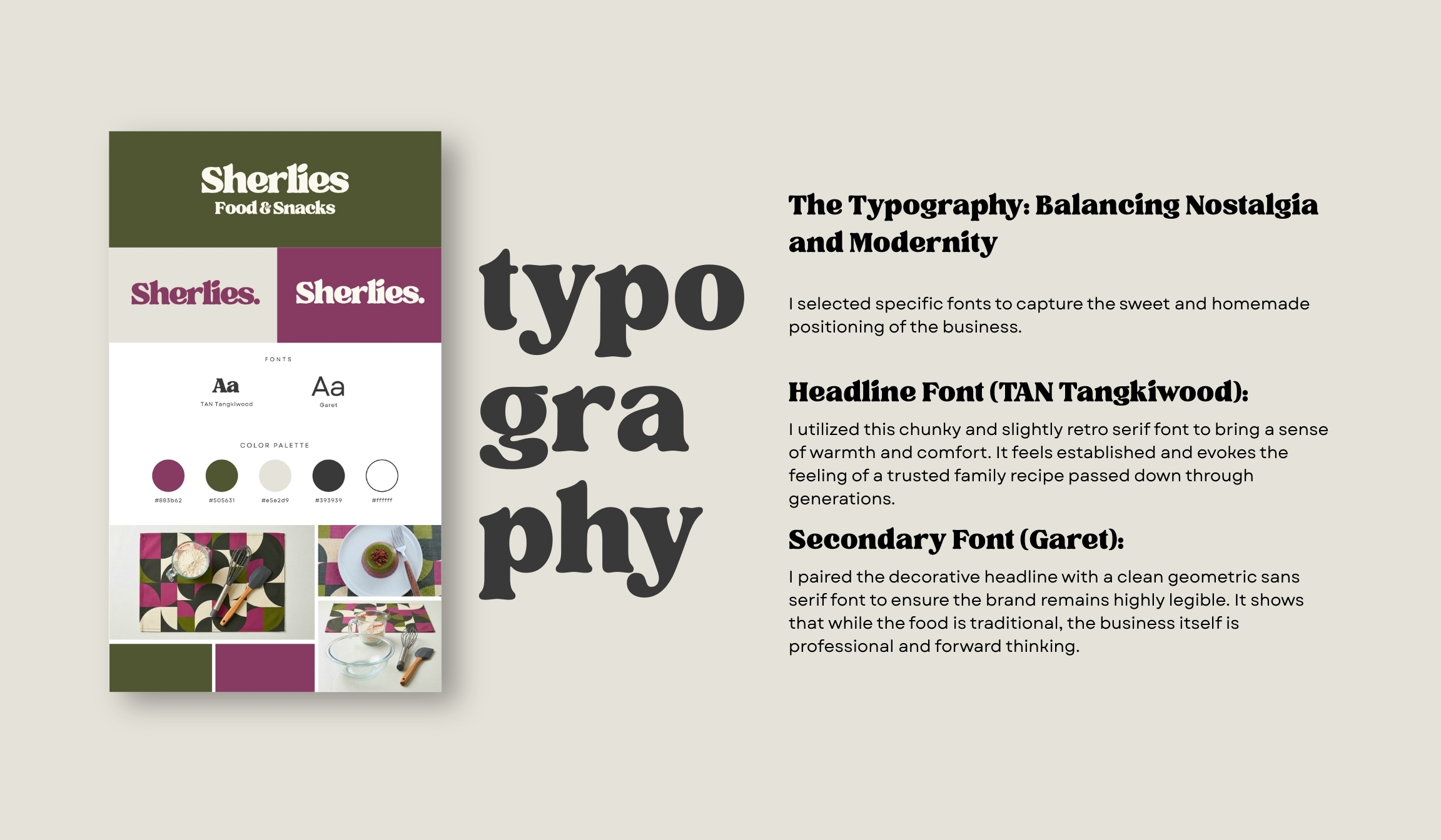
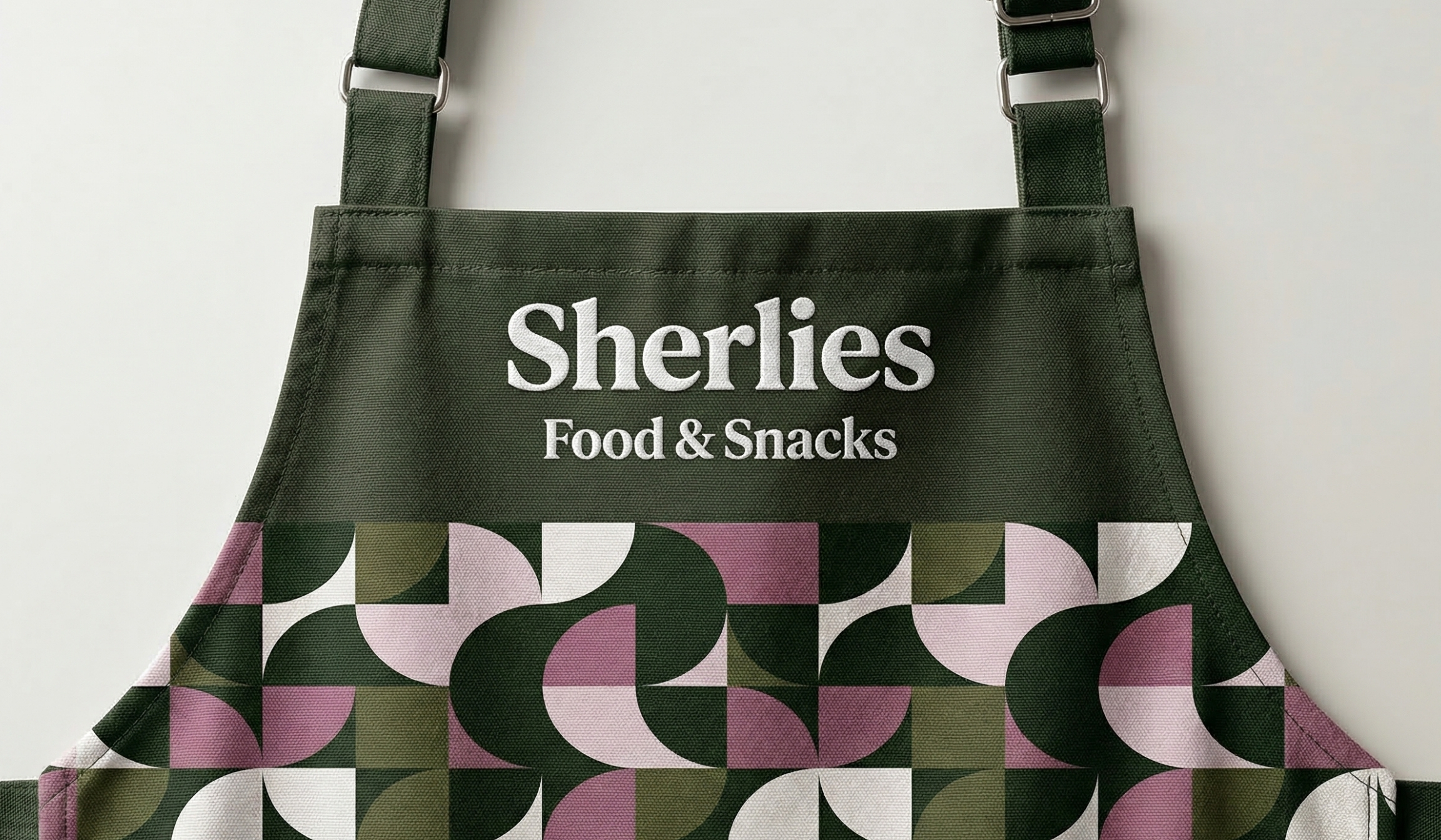
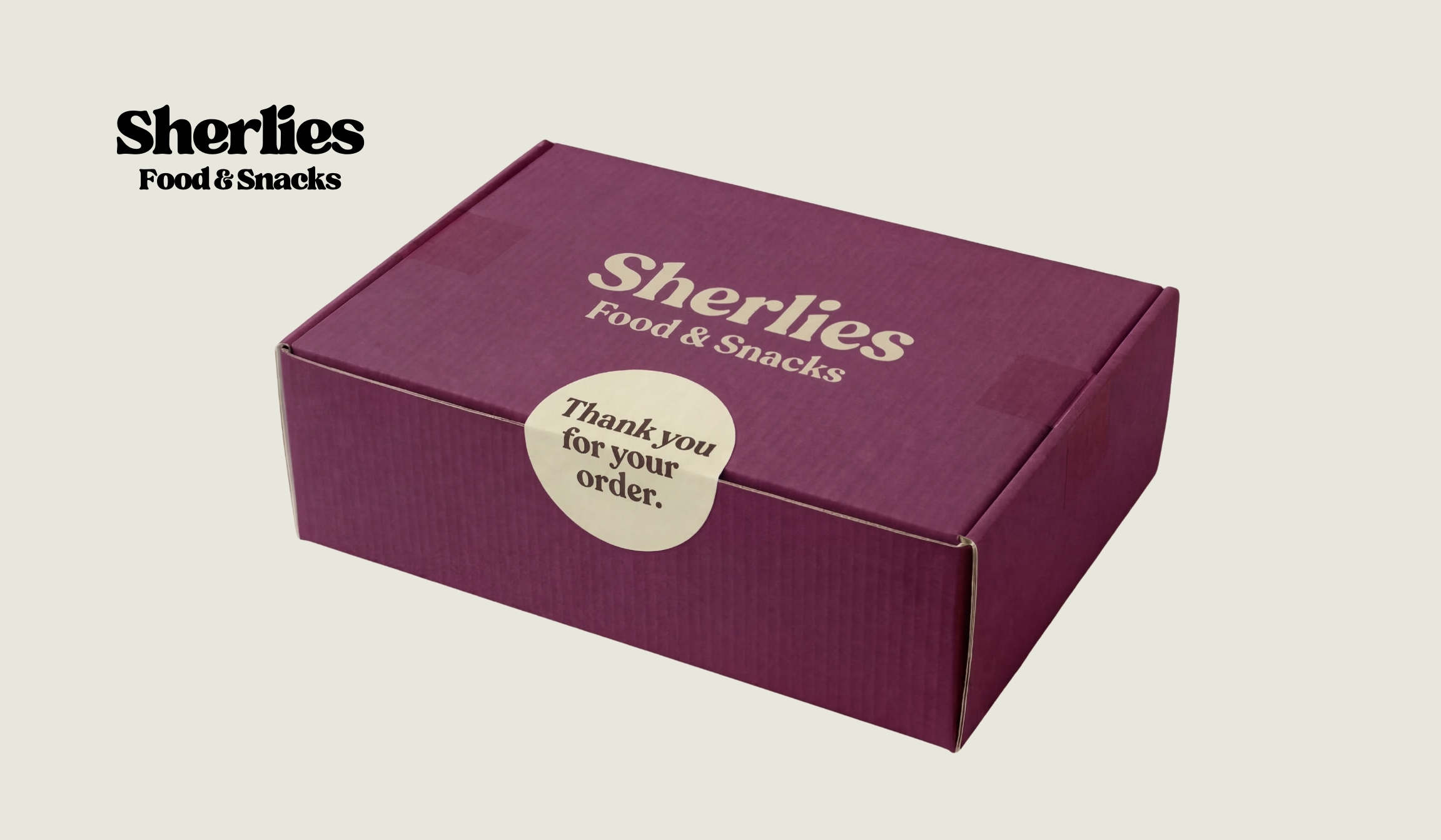
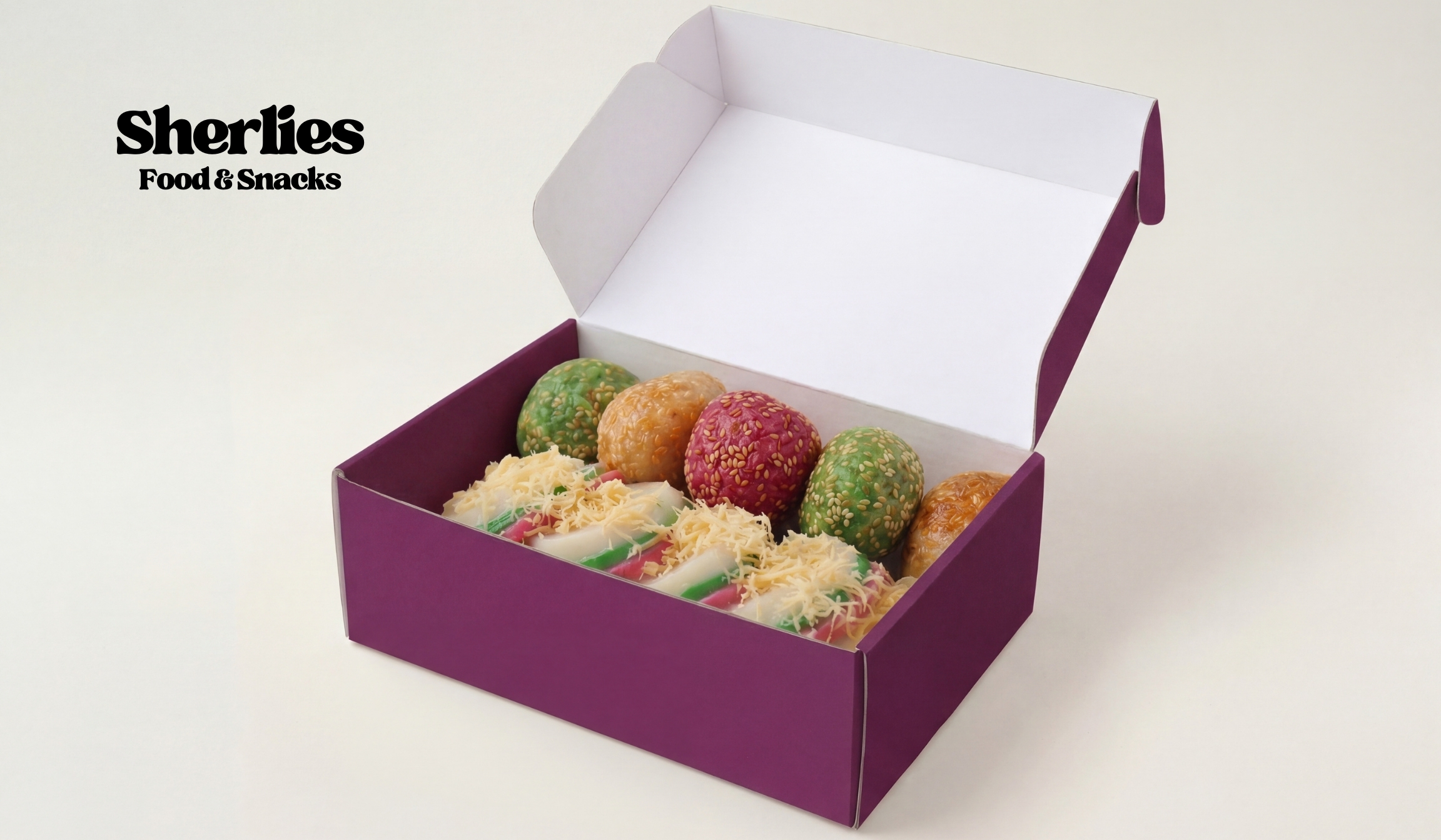
I designed this brand identity to deeply reflect the culinary heritage of traditional Filipino treats while maintaining a modern and professional aesthetic. The client specifically requested a simple logo that was not overly designed so it would easily leave a lasting mark on her customers. To achieve this, I created a purely typographic wordmark using the chunky retro serif font TAN Tangkiwood. I then paired this with the clean geometric sans serif font Garet to perfectly balance homemade nostalgia with contemporary legibility across the rest of the branding.
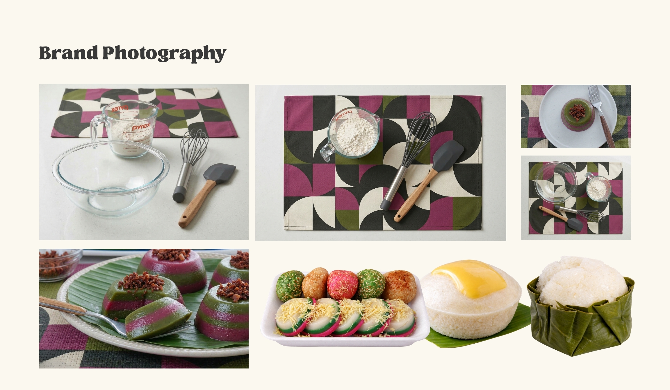
For the color palette, I chose a muted plum to represent ube, an earthy olive green to reflect banana leaves, and a cream neutral to symbolize sticky rice and coconut milk. Finally, I curated a modern geometric pattern from Canva because its circular shapes subtly mirror the look of kakanin and puto, which helps elevate these classic market snacks into a premium and giftable artisanal product.
Are you ready to design your startup brand? Let's build a visual brand identity that sets you up for success from day one.

Digital Marketing Specialist | I help small and medium businesses get more marketing work done and land more clients. My services include GoHighLevel (GHL) marketing automation, funnel building, web design and website management, social media management, and graphic design.
Email: [email protected]
©2026 - Reymart Saren | Privacy Policy | Terms of Use
Facebook
Instagram
LinkedIn
Pinterest